What is a Wi-Fi survey?
Wi-Fi surveys are used to collect information about a wireless environment in order to help plan or optimise its network. They are carried out using specialist software installed onto a portable device that records and analyses the data collected.
A Wi-Fi survey can be used for:
- Pre-deployment to help understand where to places APs for a strong and reliable connection
- Post-deployment to test the performance of a newly installed network
- Periodic checks to ensure the network is still operating as required.
Why perform a Wi-Fi survey?
- Provide optimum coverage and capacity
- Reduce IT downtime
- Keep costs down
- Boost productivity
- Increase security
What types of Wi-Fi survey are there?
- Active – the surveying device is connected to a single AP in order to measure the signal of its network. Active surveys are used to help understand and troubleshoot current Wi-Fi networks.
- Passive – the surveying device is not connected to any AP and only ‘listens’ to the wireless environment. Passive surveys are used to gather information about all APs in the area to obtain an overview of its Wi-Fi performance.
- Predictive – performed prior to deployment, predictive surveys create a simulated model of a wireless network to help determine the best locations for APs to be installed.
What is needed for a Wi-Fi survey?
- Licensed Survey Software Program
- Floor plan of location
- User specifications (Voice, Data and Video support)
Spectrum Analysis Overview
Most wireless networks and devices today use radio frequency (RF) technology to transmit data and certain types of devices use different sections or “bands” for transmission. Wi-Fi equipment has been allocated by international governing bodies to use certain unlicensed sections of the RF spectrum – specifically at 2.4 and at 5 GHz – for its operation. Being unlicensed, these bands are shared between many, many different kinds of devices and are the only section of spectrum where they are legally allowed to transmit RF signals. In environments like offices, warehouses or high-tech residences, where several wireless devices vie for the same spectrum space to communicate, interference can occur and networks become slow, drop connection or crash.
Why spectrum analysis?
Since RF signals are invisible to the naked eye, a spectrum analyser (like WiPry Clarity) is necessary to see into the wireless landscape to observe what is transmitting and where in the spectrum the “noise” is occurring. Sometimes the solution is to change the channel of the Wi-Fi network to avoid the other signals, and sometimes eliminating the offending wireless devices that “don’t play well with others” is the answer. Occasionally, in situations where interference cannot be avoided or eliminated, the only solution is to switch Wi-Fi bands completely. Without spectrum analysis, implementing the proper solution is an expensive and time-consuming game of trial and error.
2.4 GHz Overview
The 2.4 GHz band contains eleven channels (and up to 13 or 14 in Europe and Japan, respectively), but only channels 1, 6, and 11 do not overlap. The 2.4 GHz band offers the widest compatibility with Wi-Fi devices through 802.11b/g/n/ac, but with only three channels to chose from, the 2.4 GHz band is often very limited in the amount of traffic that it can sustain. While the 2.4 GHz band offers good range, it also suffers from non-Wi-Fi interference caused by electronic devices like cordless phones, security systems, microwave ovens, wireless audio-visual systems, Bluetooth devices, and more.
5 GHz Overview
The 5 GHz band contains 24 non-overlapping channels, which gives it a significant advantage over the 2.4 GHz band’s three non overlapping channels. With more channels to choose from, interference avoidance is as simple as choosing an unused channel. Additionally, fewer electronic devices use 5 GHz, meaning Wi-Fi access points operating in this frequency range have fewer RF signals to compete with. Although the 5 GHz band is relatively quiet and has many more available channels, it is widely believed to be only a matter of time before this band is as congested as the 2.4 GHz band.
6 GHz Overview
The 6 GHz band, introduced for Wi-Fi use with the 802.11ax (Wi-Fi 6E) standard, offers a substantial leap in available spectrum compared to 2.4 GHz and 5 GHz. It contains 59 non-overlapping channels, providing much more space for devices to operate without interference. This increased bandwidth dramatically reduces the chance of congestion, even in densely populated environments. Operating exclusively for Wi-Fi 6E and future Wi-Fi 7 devices, the 6 GHz band ensures faster speeds and lower latency by supporting wider channels (up to 160 MHz) and more efficient data transmission. Unlike the 2.4 GHz and 5 GHz bands, the 6 GHz band is free from legacy devices, leading to cleaner, less congested wireless environments. However, it comes with a trade-off: the 6 GHz band has a shorter range and lower penetration through walls and obstacles due to the higher frequency, which can impact performance in larger or heavily obstructed areas. In summary, while the 6 GHz band excels in providing faster speeds and cleaner signals, it is best suited for environments where coverage is not obstructed, such as open spaces or with the use of more access points to maintain strong connectivity throughout larger areas.
Why choose Connect-Focus?
Our network of certified engineers are skills matched to each assignment to ensure they have the right qualifications and experience to deliver the best service possible.
From the initial planning right through to the survey and installation, our team will work with you every step of the way to ensure your solution meets your exact requirements with minimal disruption to your business.
Passive Survey
Our Wi-Fi Site Survey collects detailed data on your network and surrounding networks and then visualizes that data. Each view is designed to reveal critical details about your network in an intuitive and informative way. Our engineer will identify coverage voids, map any signal leakage from your building, discover the existence and location of rogue access points, map channel usage, determine effects of neighbouring access points, visualize overlapping access point coverage, and much more.
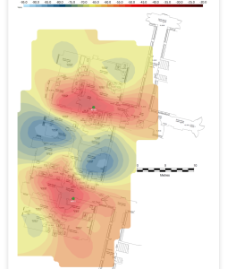
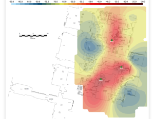
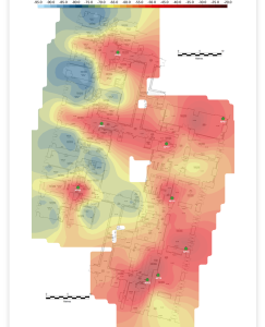
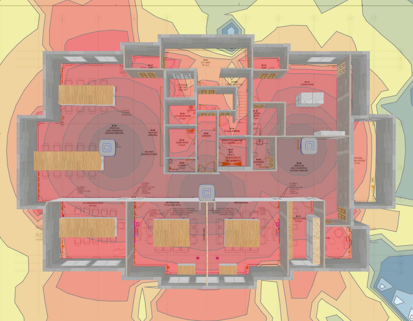
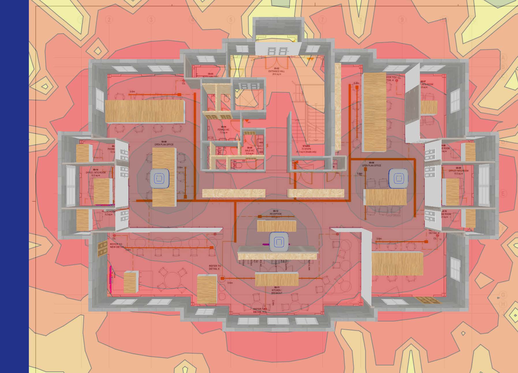
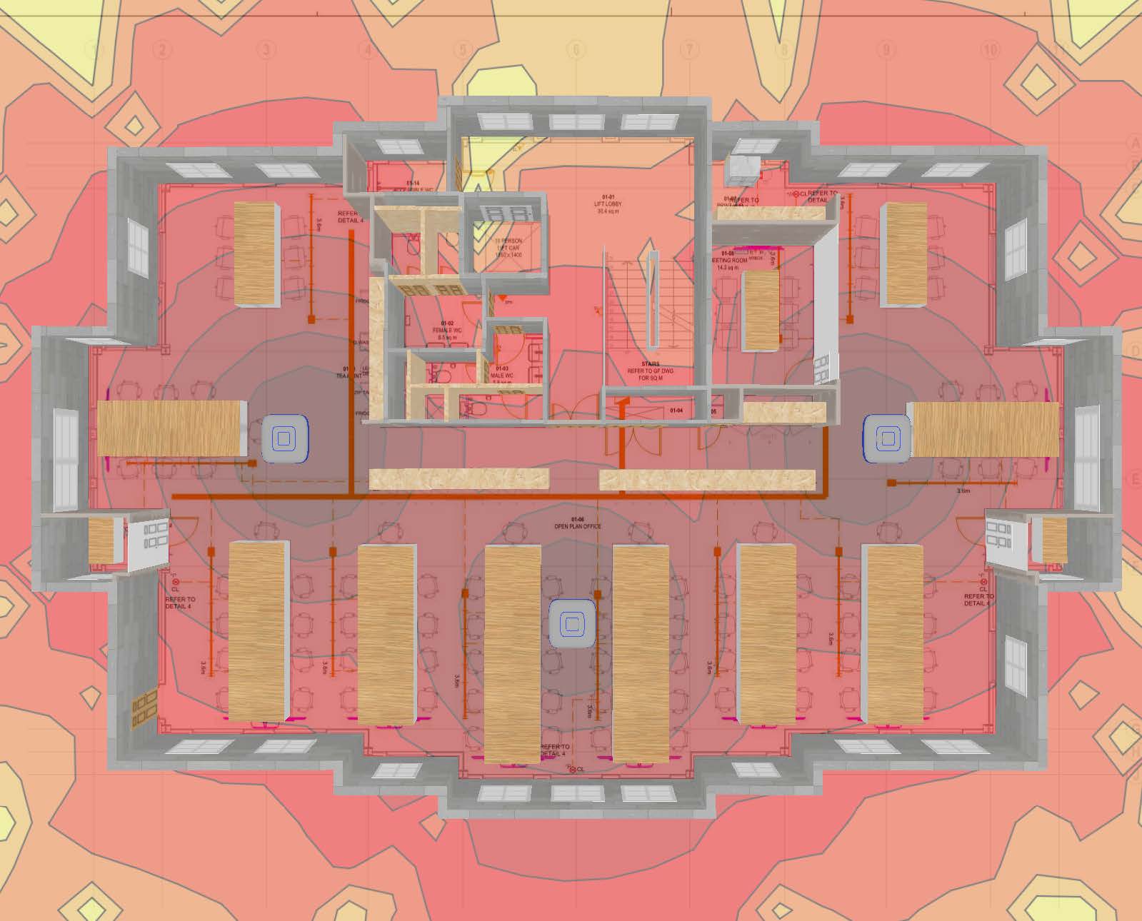
The Heatmap Graph provides a visual representation of signal strength and coverage in a specific physical area, offering insight into where Wi-Fi signals are strongest and where they may need improvement. It is typically used to map out the performance of a network across different rooms or areas. It displays signal strength across a floor plan or building layout. This color-coded view allows you to identify where Wi-Fi coverage is strong and where it needs improvement, helping in optimizing access point placement or adding additional coverage:
Red Areas: These represent the strongest Wi-Fi signals, typically with a signal strength above -40 dBm. This is excellent coverage, where Wi-Fi performance is at its peak and devices should experience seamless connectivity.
Orange/Yellow Areas: These areas show signal strength between -55 dBm and -65 dBm, indicating good to moderate Wi-Fi coverage. Performance is generally strong, though the signal may start to degrade slightly as you move towards the yellow regions.
Green Areas: These regions correspond to signal strength between -70 dBm and -80 dBm, representing weaker Wi-Fi signals. In these areas, devices may experience slower speeds, reduced reliability, or occasional connection drops.
Blue Areas: These are the weakest zones, with signal strength below -80 dBm. Wi-Fi coverage is poor here, and devices are likely to struggle maintaining a connection or may fail to connect at all.
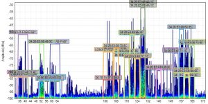
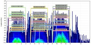
The Density Graph maps and displays what is currently happening in the spectrum, so you can identify devices, see how loud they are, and see how often they are transmitting.
With Colour by Utilization enabled, the height of the graph shows how loud devices are (amplitude), and the intensity of the colour shows how often signals are occurring. The more intense the colour, the more often the frequency is in use. This is called utilization which is similar to duty cycle and airtime usage. For example, if a frequency has 40 percent utilization, it is only free for use by other transmitters for 60 percent of the time.
A blue spike or shape indicates a short signal, like a clap. A red spike or shape indicates a long, continuous signal, like an air horn.
Blue – Less than 10 percent utilization
Green – 20 percent utilization
Yellow – 40 percent utilization
Red – Over 50 percent utilization
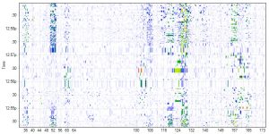
The Waterfall Graph marks amplitude over time for al frequencies in the selected band, much like a seismometer graphs earthquakes. This view is useful for watching the spectrum over time.
Unlike the Density Graph which uses Colour by Utilization, the intensity of the colour in the Waterfall Graph indicates amplitude. Blue indicates low-amplitude signals, while red indicates high-amplitude signals.
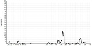
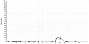
Utilization measures the percentage of activity above a defined amplitude threshold. Utilization is similar to airtime usage and duty cycle. The Utilization Graph gives more exact representations of utilization in the spectrum than the Density Graph’s approximations.
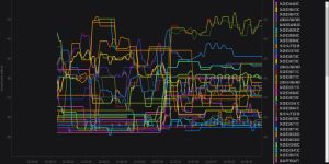
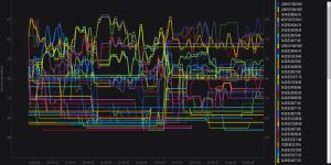
The Networks Graph represents Wi-Fi signal strength over time, using data collected from the computer’s Wi-Fi card. The signal strength represents amplitude levels of transmit beacons that were received by the card. Drops in signal strength indicate poor coverage, and can be referenced against the Density and Waterfall views to determine if interference is the problem.
Predictive Survey
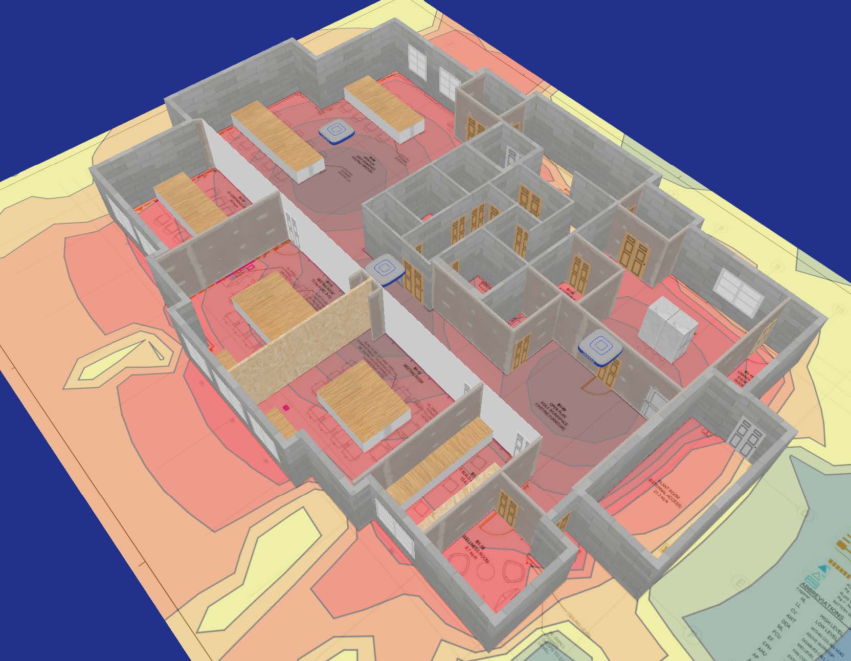
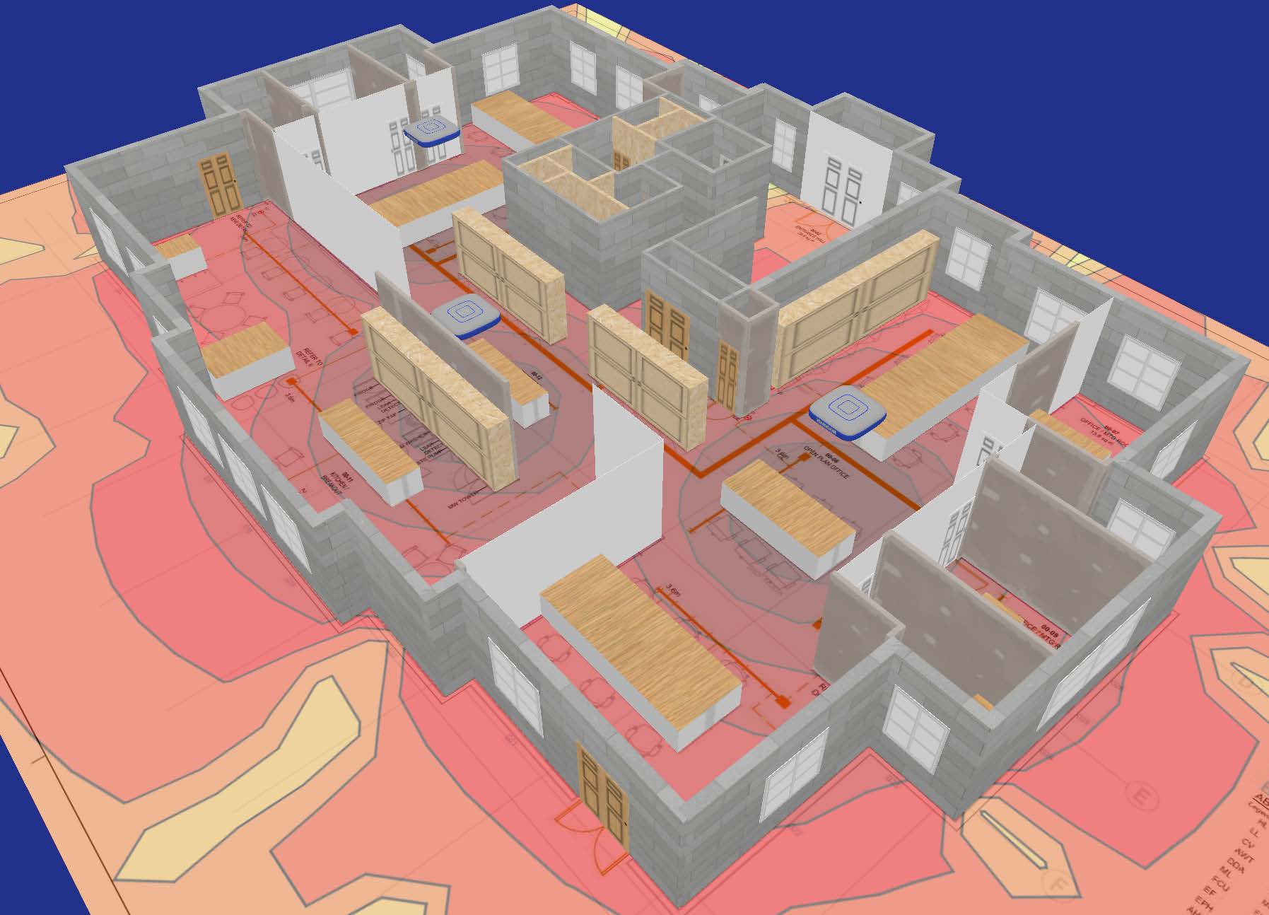
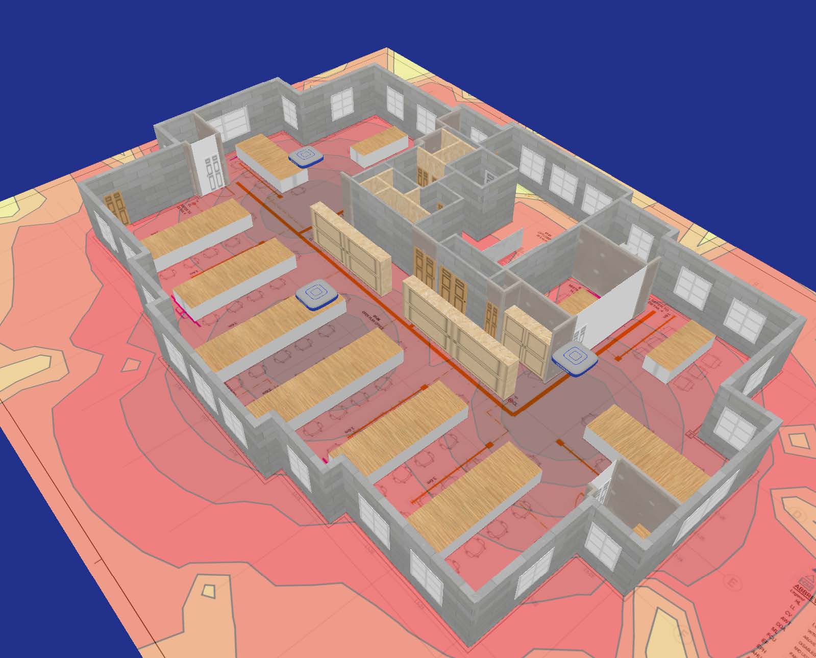
Connect Focus also has the ability to perform predictive site surveys. A predictive survey is when we define, using a floor plan, the barriers (walls and other solid objects) in the survey area along with the location and characteristics of one or more access points and then run a theoretical simulation of how radio waves would propagate through the survey area. The result is a coverage heatmap that estimates signal strengths. This can be done without attending your premises, long before the survey area even exists in the real world.

